25 July 2023
Every wedding is a special event. Everyone wants to make their wedding different to others, trying to make something special that will stand out from the crowd. One of the ideas what you can do is – a bespoke design of your wedding stationery!
Our graphic designers created lots of very different wedding stationery designs tailored to clients wedding themes and styles. Now we would like to share some examples with you. I hope you’ll like it 🙂
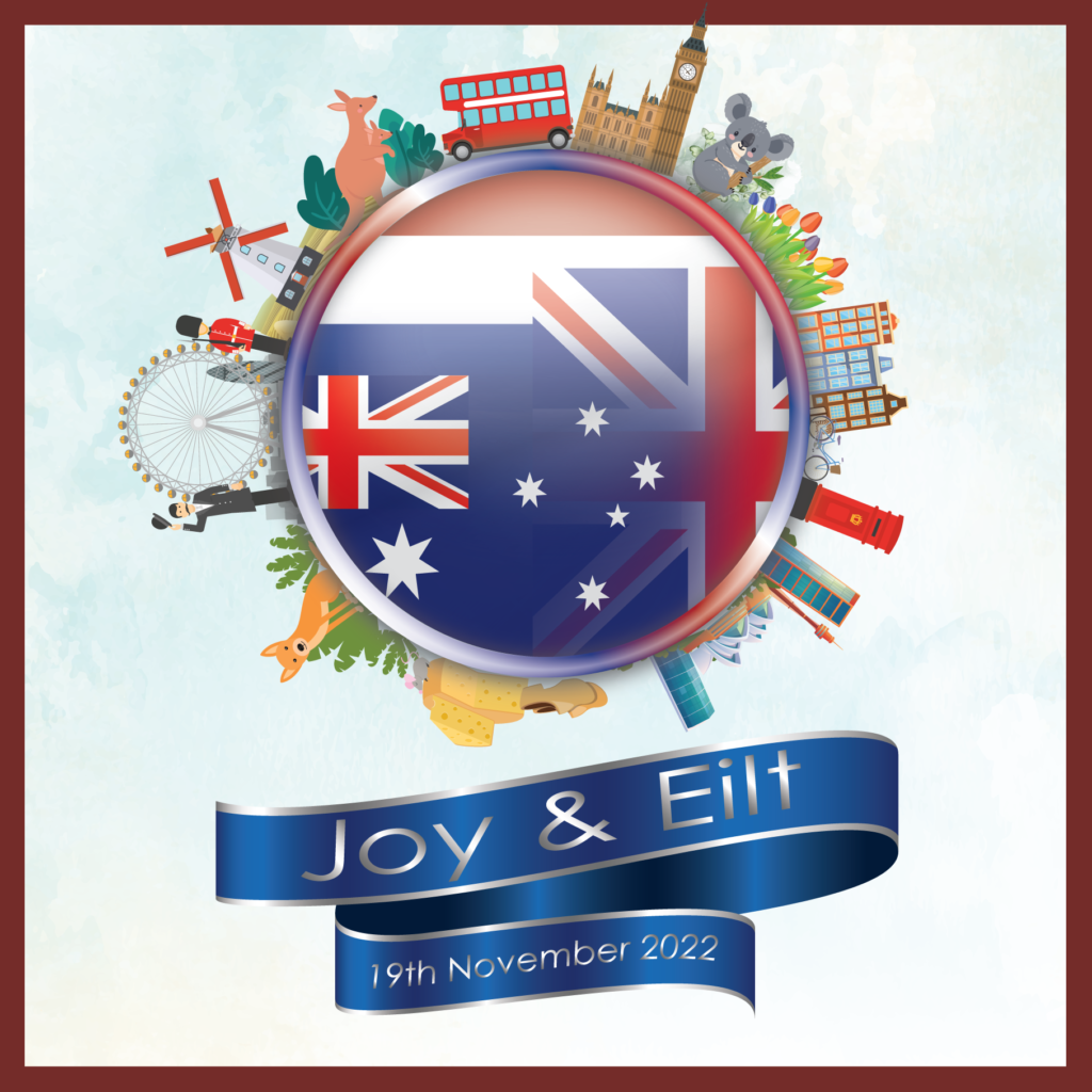
- First invitation was created for a couple with UK/Australian/Dutch roots, hence on the front invitation page you can see a collage of UK/Australian and Dutch flags surrounded by the most iconic symbols related to each country like – kangaroo with Australia, wooden clogs with Netherlands or Big Ben with the UK.
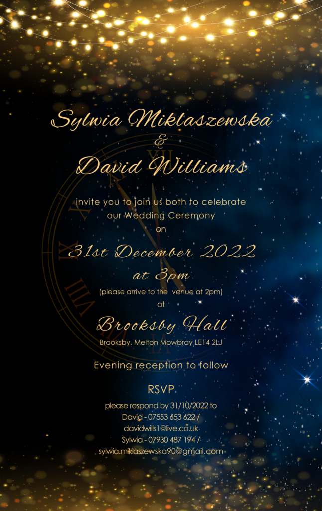
- Second design we would like to show you, is New Year’s Eve style invite. The couple has met for the first time on 31st December and they were getting married on the same day (obviously different year :)), so the idea was to create celebrative and sparkling, but elegant invitations for this event, so we combined stars and dark night with the sparkling party lights and golden flakes. In the background you can notice a clock with the hands approaching midnight! Invites were printed on the glittering metallic paper to accelerate the effect.
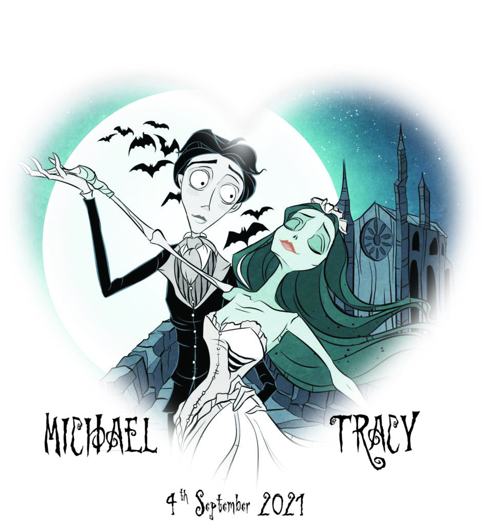
- Third design was created for a couple who loved a Corpse Bride film. They had even a wedding cake in this style! So, our design had to follow this idea. We have created ‘animated’ version of both main characters from the movie in the wedding outfits in the dancing posture. Insert of the invite followed with additional graphics in the ‘horror’ style.
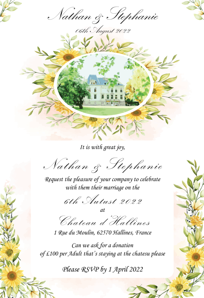
- Fourth design is a bit more classic – the client wanted to include photo of their venue (a lovely palace in France!) combined with their favourite flowers – sunflowers. Please admire our final result 🙂
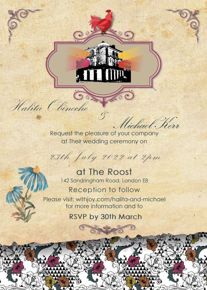
- Fifth design was created for an artistic couple whose wedding was organised in very eclectic place called The Roost. The invites were about to follow that ‘old school’ style together with the photo of the venue. So, our idea was to create a design which looks like a bit ‘old fashioned’ merged with eclectic floral feel at the bottom imitating a wallpaper taken of the wall.
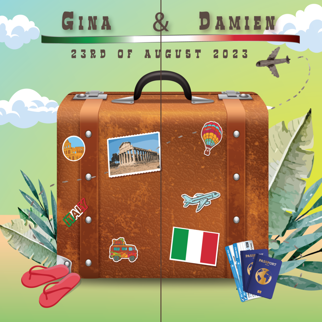
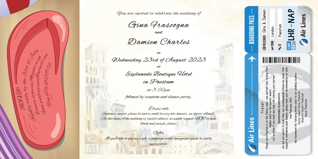
- Finally – the last design we would like to show you here – is travel style wedding invite – 3 in 1 – invitation together with RSVP card and Guest information in one. Wedding was organised in Paestum, Italy, so we have added a shaded view of a typical Italian town in the background.
We hope you loved our designs 🙂 Please note apart form the bespoke artwork we can fully help you with the printing, folding, etc – so you don’t have to worry about it! 🙂
Invitation style can then be expanded for any other stationery you may need.
